Bandcast | App
Product Design
Multi-track Podcast and Chat Recorder App for iOS
My Role
Lead Product Designer
I designed the entire task completion funnel for the main flow of the app based on user research and testing. I designed the visual identity and app icon.
Team
Product Designer - 1
Developer - 1
Stakeholders - 2
Timeline
August 2020-March 2021
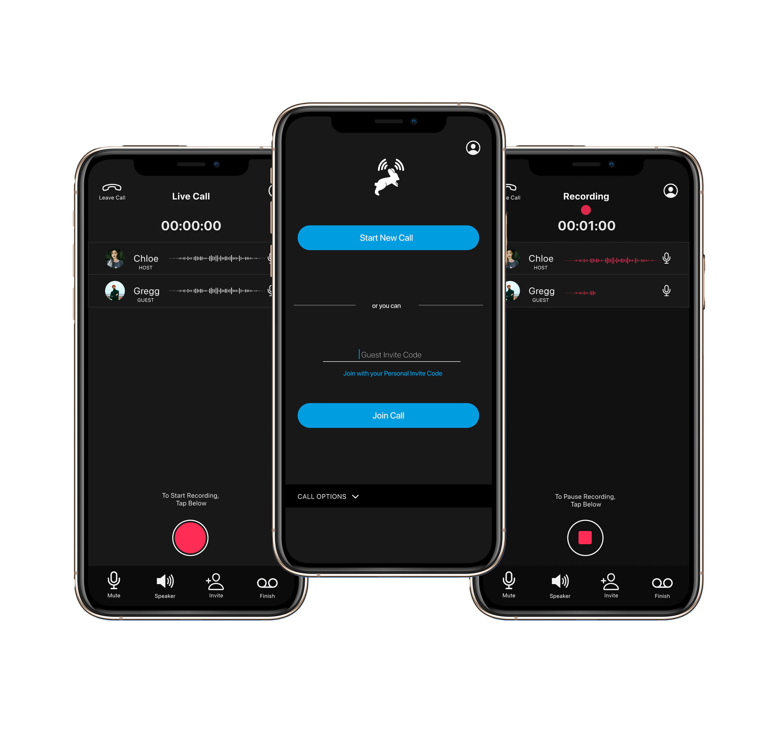
BandcasT app is a multi-track podcast recorder for mobile iOS. It can be used for live recording calls, live chat, important conversations and more. This app makes recording a podcast or phone meeting as easy as a few clicks of a button. Hosts and their guests can connect on a call in the app, press record and get delivered professional studio quality recordings.
I designed the visual identity and logo of Bandcast App
Design Process Overview
Validating Creative Solutions

Empathize | Understand the User’s Needs
Define | Analyze and Synthesize
Ideate | Generate Creative Ideas
Prototype | Design Intuitive Journey’s
Test | Validate Designs with Feedback
Empathize
Understand User Needs
Objective
The stakeholder’s in the company were podcaster’s with clear business goals and insight into the industry. I started by conducting interviews and observing podcasters in the context of their environment. I discovered that they wanted a quick and easy way to record quality calls with guests anytime and anywhere. In the competitive analysis I learned about how other companies were solving these problems for users. This information showed me where the gaps were and gave me ideas on how they could be filled.
Who am I solving this problem for?
What exactly is the problem?
How is it already being solved?
Why do they need a new solution?
Deliverables
Collection of Qualitative Data through Interviews, Observations and Competitive Analysis.
Define
Analyze + Synthesize
Objective
With all of the data collected I was able to create user personas and a problem statement based off of the needs of the user. I used affinity diagramming to organize the information and user personas to get a good picture of who I was designing for and develop deeper insights.
This information gave me insight into the story of the user. I could see that they ranged from experienced with professional equipment to newcomers with little to no equipment. They all had one goal, easily create high quality podcasts with interviews, anytime, anywhere and share them with the world.
Affinity Diagramming to identify and organize categories
User persona and Stories to understand who I am designing for
Develop a goal oriented problem statement by combining the user, their need and the reason or insight.
Deliverables
User Personas
An actionable problem statement
Problem Statement
Podcasters of varying levels need a way to easily record high quality podcast with guests because audio solutions, software and equipment can be difficult to use, not easily portable and aren’t able to be shared with guests who are in a different location.
Ideate
Generate Creative Ideas
Objective
With a Problem Statement I was able to use mind mapping to associate ideas, user flows to visualize the journey and quick sketches based off of abstract ideas to develop non judgmental concepts. I wanted to find a way to optimize the experience while keeping the user engaged and on their happy path. It was important that they understood the purpose of the tool and how to navigate it. I wanted to build an easily findable and discoverable tool that was minimal but also displayed the the softwares capabilities.
I was able to come up with different design solutions that solved the problem in different ways. From here I gathered feedback from the stakeholders and the developer.
Mind Mapping
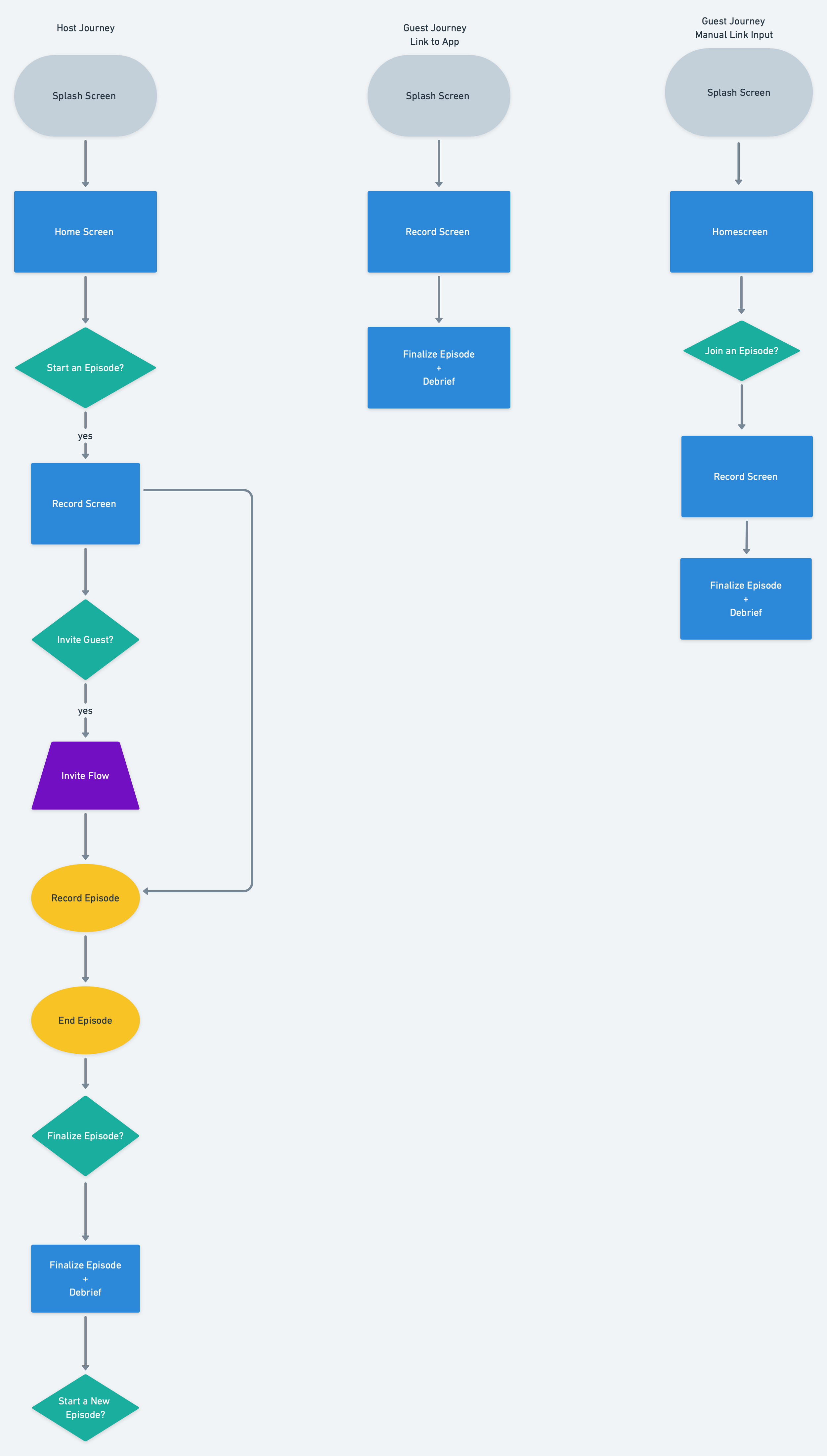
User Flows
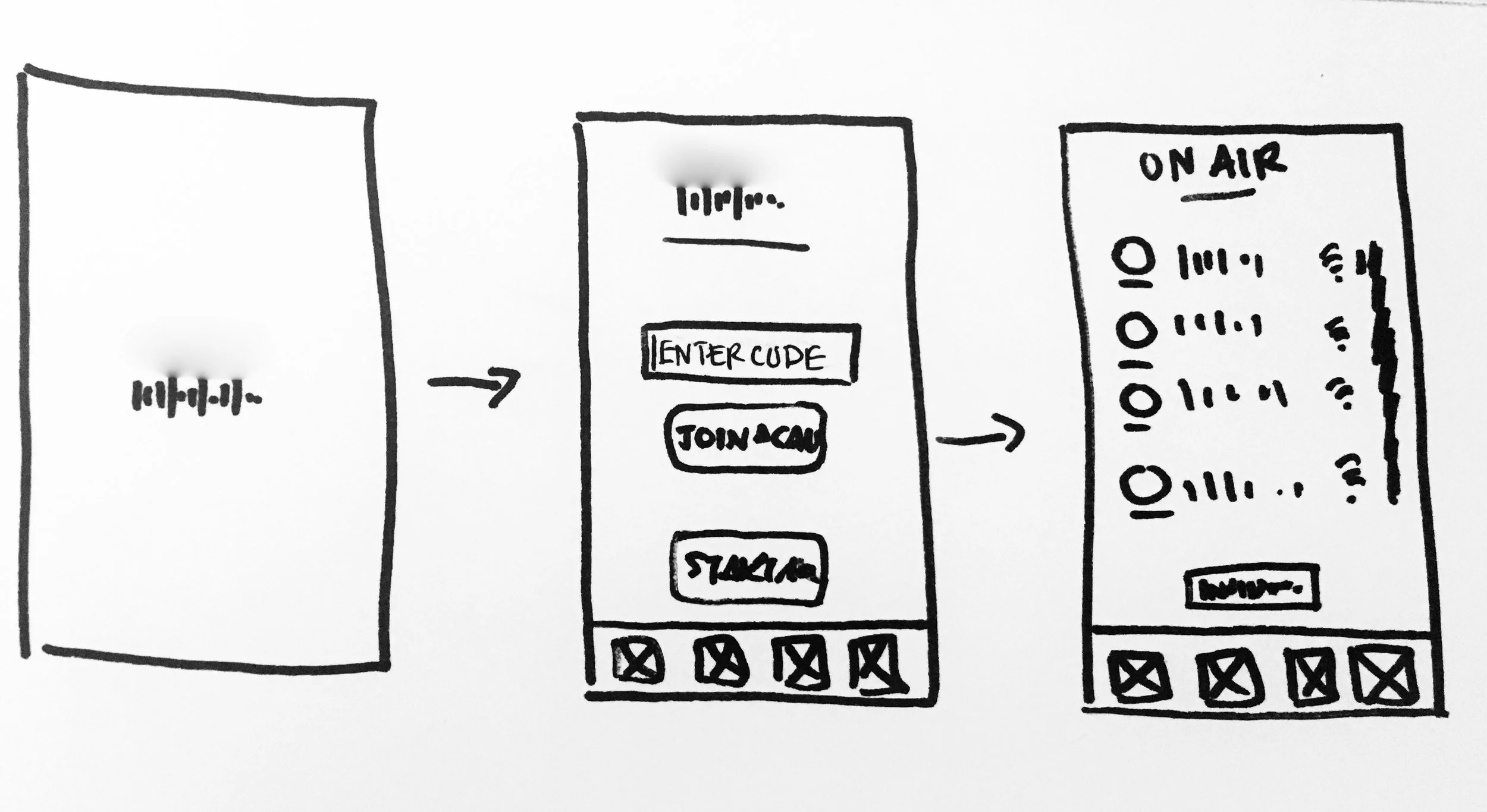
Quick Sketches
Deliverables
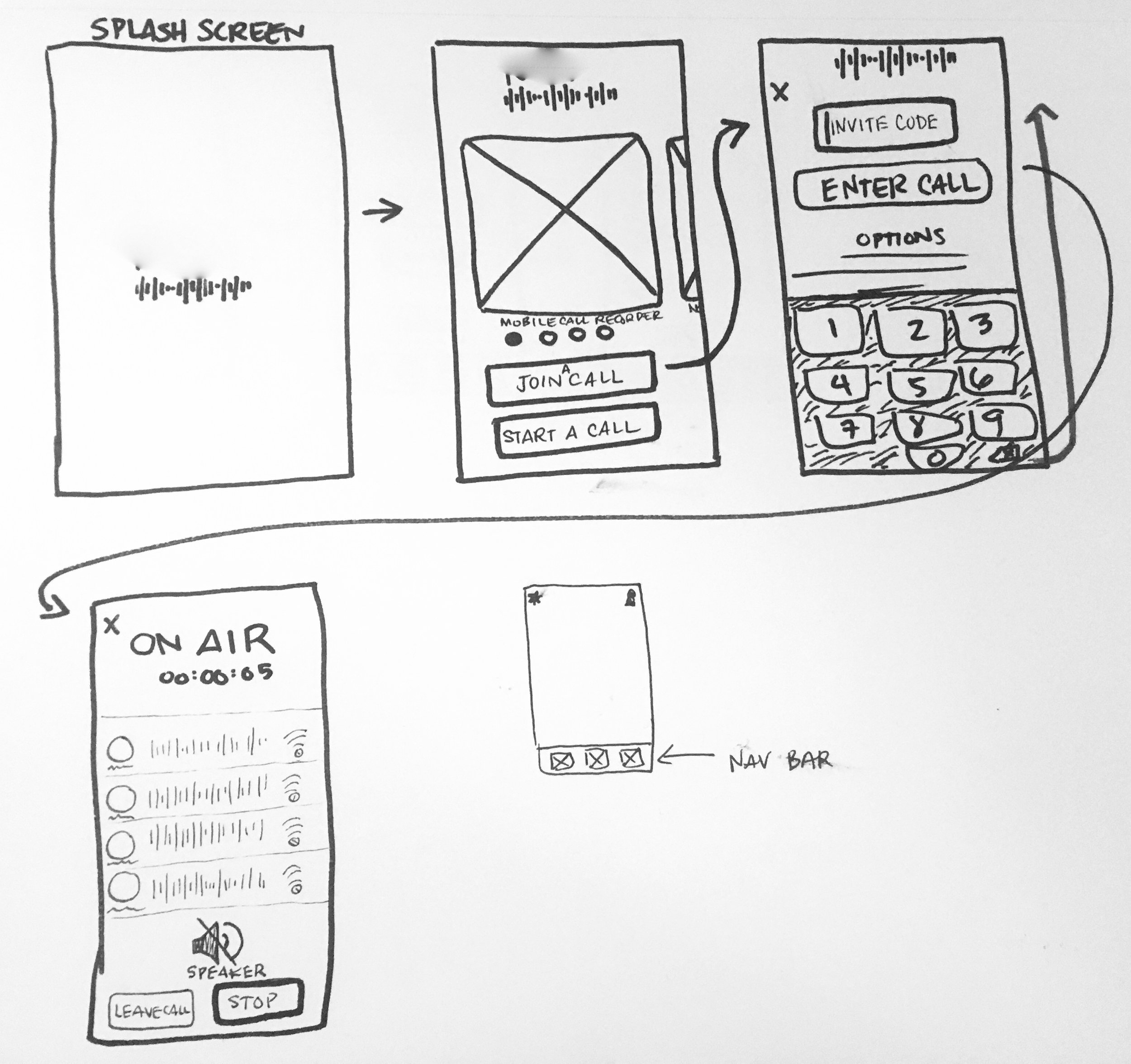
Wireframe Sketches
Prototype
Design Intuitive Journeys
Objective
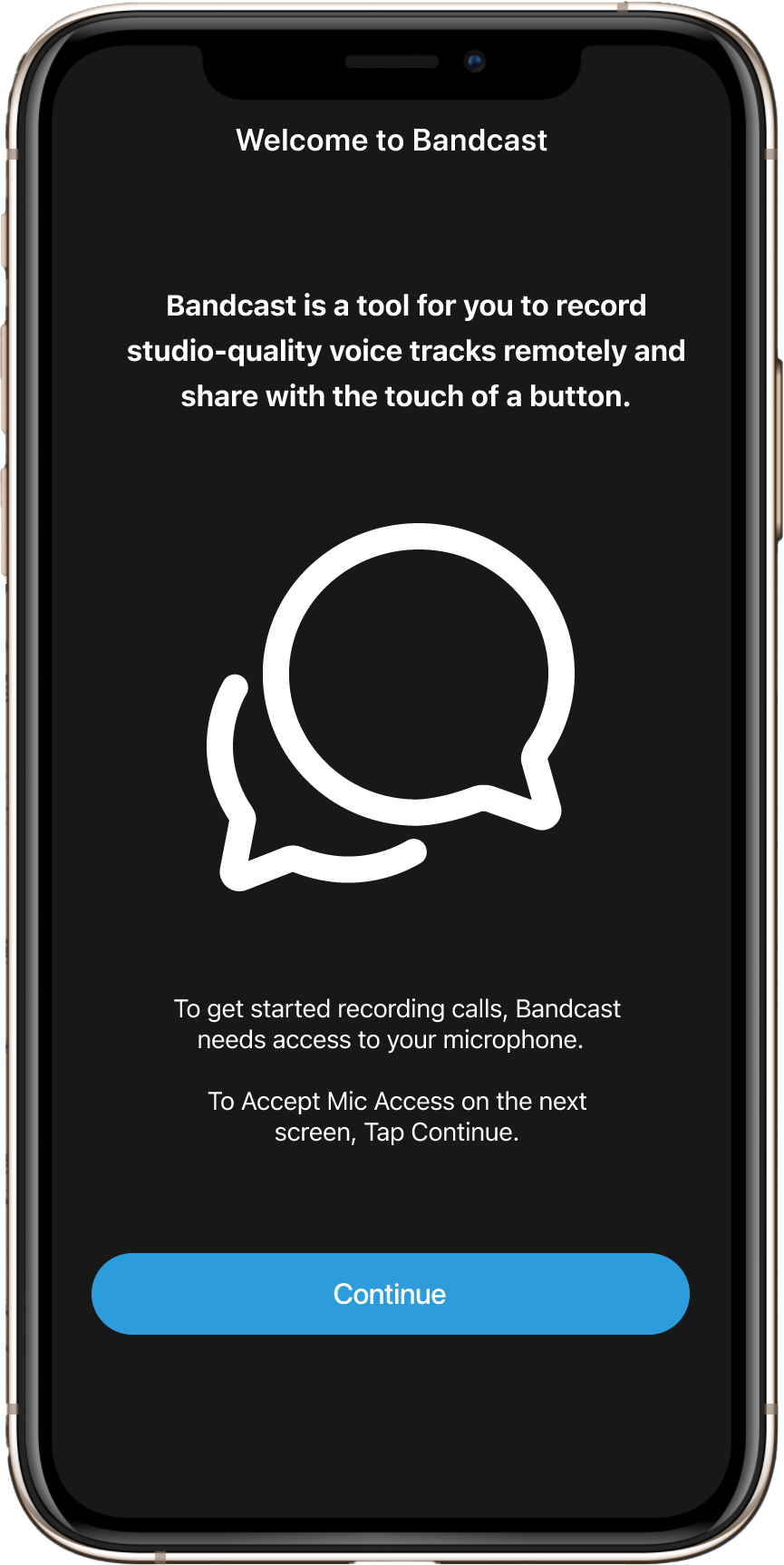
I began the prototyping phase by creating the information architecture and wireframes so that the user’s journey is easy to navigate and the affordances and signifiers are clear and optimized. As I went along I utilized UX writing to define the actions and content of each screen, which will be developed and refined later in the process.
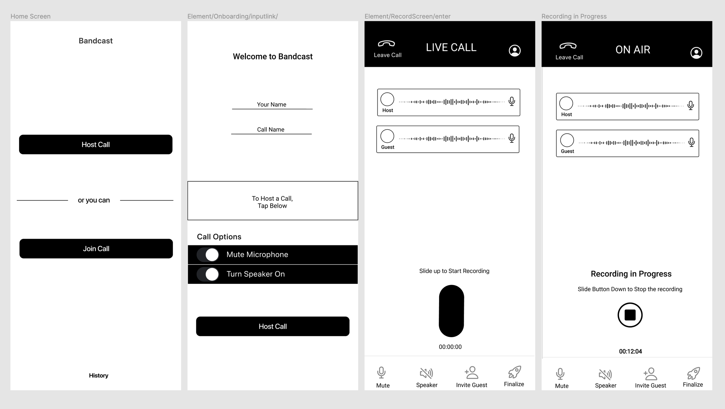
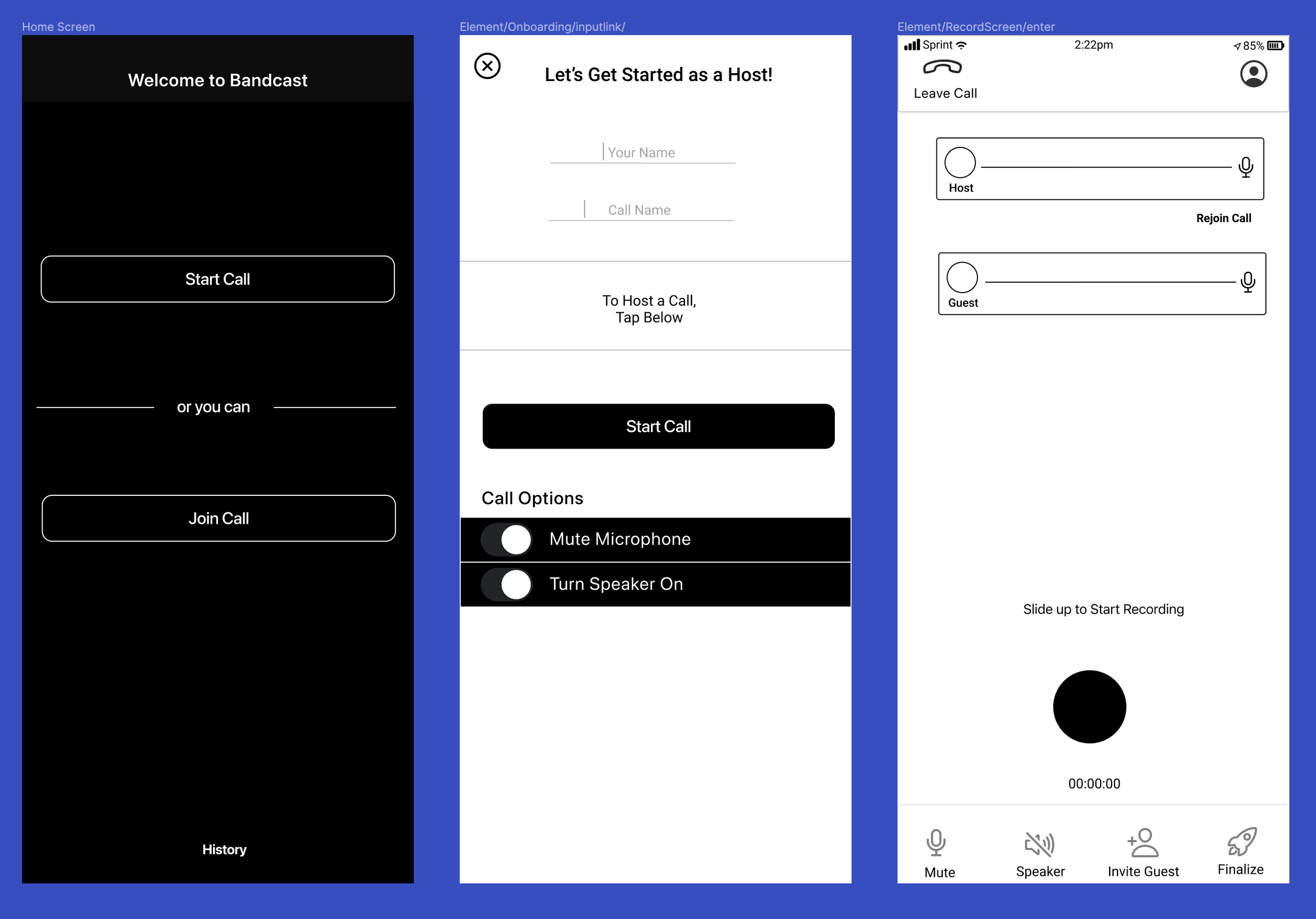
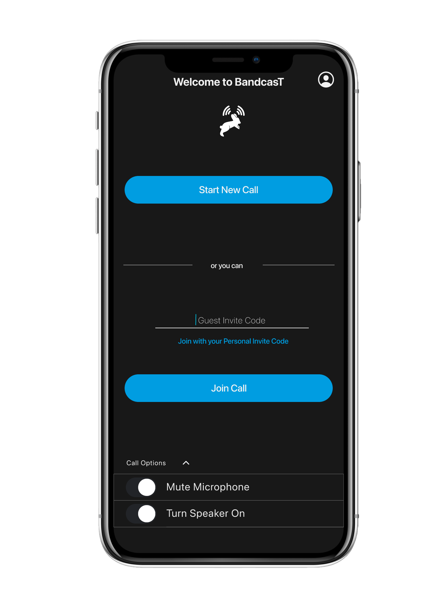
Once I finished the initial low fidelity wireframes I gathered feedback on the designs and then move on to the high fidelity prototype where I considered how the visual hierarchy and identity comes into play with accessibility and navigation of the screens. Icons, colors, buttons, headings and micro-interactions all keep the user on their path and understanding where they are, what they are doing and where they are going.
Information Architecture
Low Fidelity Wireframes
High Fidelity Interactive Prototype
Deliverables
High Fidelity Interactive Prototype
—————————- or you can——————————